Sign up for daily news updates from CleanTechnica on email. Or follow us on Google News!
Tesla released its second quarter delivery data a few days ago, and Tesla stock went a bit wild afterward. Apparently, deliveries were higher than the market expected. They were still down year over year, but the Wall Street consensus was that they would be down much more than they actually were. In any case, I love looking at the long-term trends, so, as I’ve done for the past several years, I’ve created a number of charts to display Tesla’s quarterly sales over time. Let’s jump in.
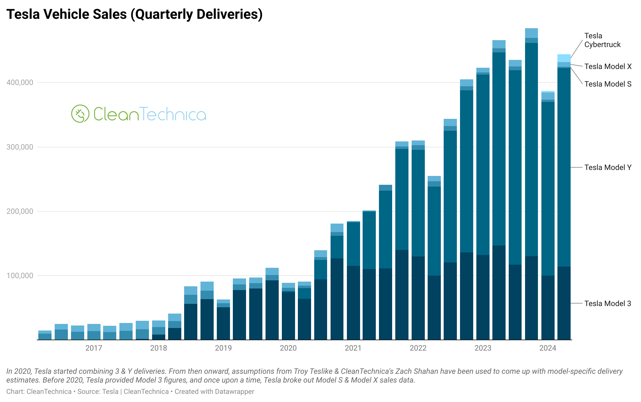
This first chart is the most general. It shows overall quarterly sales of Tesla vehicles globally. It shows the strong, quite consistent rise in sales over the past several years. However, it also shows that Tesla has had a drop in quarterly sales this year — down year over year in Q1 by a lot and down year over year in Q2 by a bit.
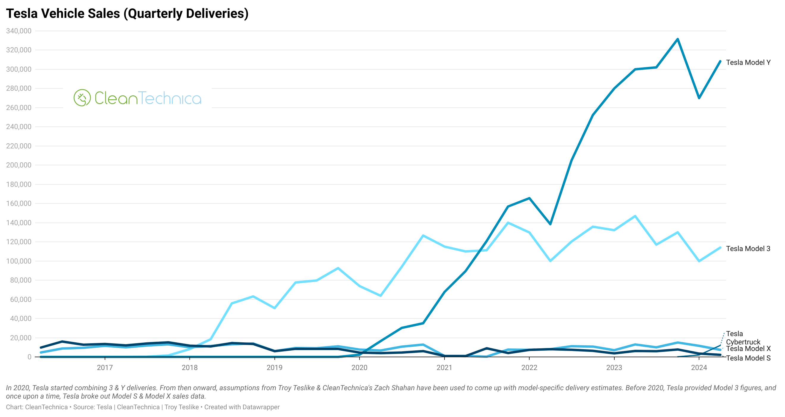
With this line graph, we’re still using official figures from Tesla. Tesla combines sales of the Model 3 and Model Y, and also combines data for the Model S, Model X, and Cybertruck. (It’s annoying that Tesla does this, but I don’t see it changing unless Tesla starts to break out Cybertruck sales at some point.) What we see down at the bottom is that sales of those latter three models don’t really matter compared to the massive scale of Tesla’s Model 3 plus Model Y sales. Of course, we can see that 3/Y sales bounced up a bit in the second quarter after a sharp 1st quarter drop. However, if you look closely, you can also see that they are lower than Q2 2023’s sales by a significant margin. Will Q3 turn things around? The last time Elon Musk commented on it, he said that 2024 sales would be higher than 2023 sales. Tesla’s going to need a big boost to achieve that in the second half of the year.
At this point, we have to incorporate some estimating. Because Tesla doesn’t fully break out sales by models, I use a specific formula for how many deliveries are deliveries of the Model 3, Model Y, Model S, Model X, and Cybertruck based on various sources and news items. In this case, breaking things out, not much changes in the Tesla quarterly sales narrative. But it’s fun to look at how the different models (presumably) compare.
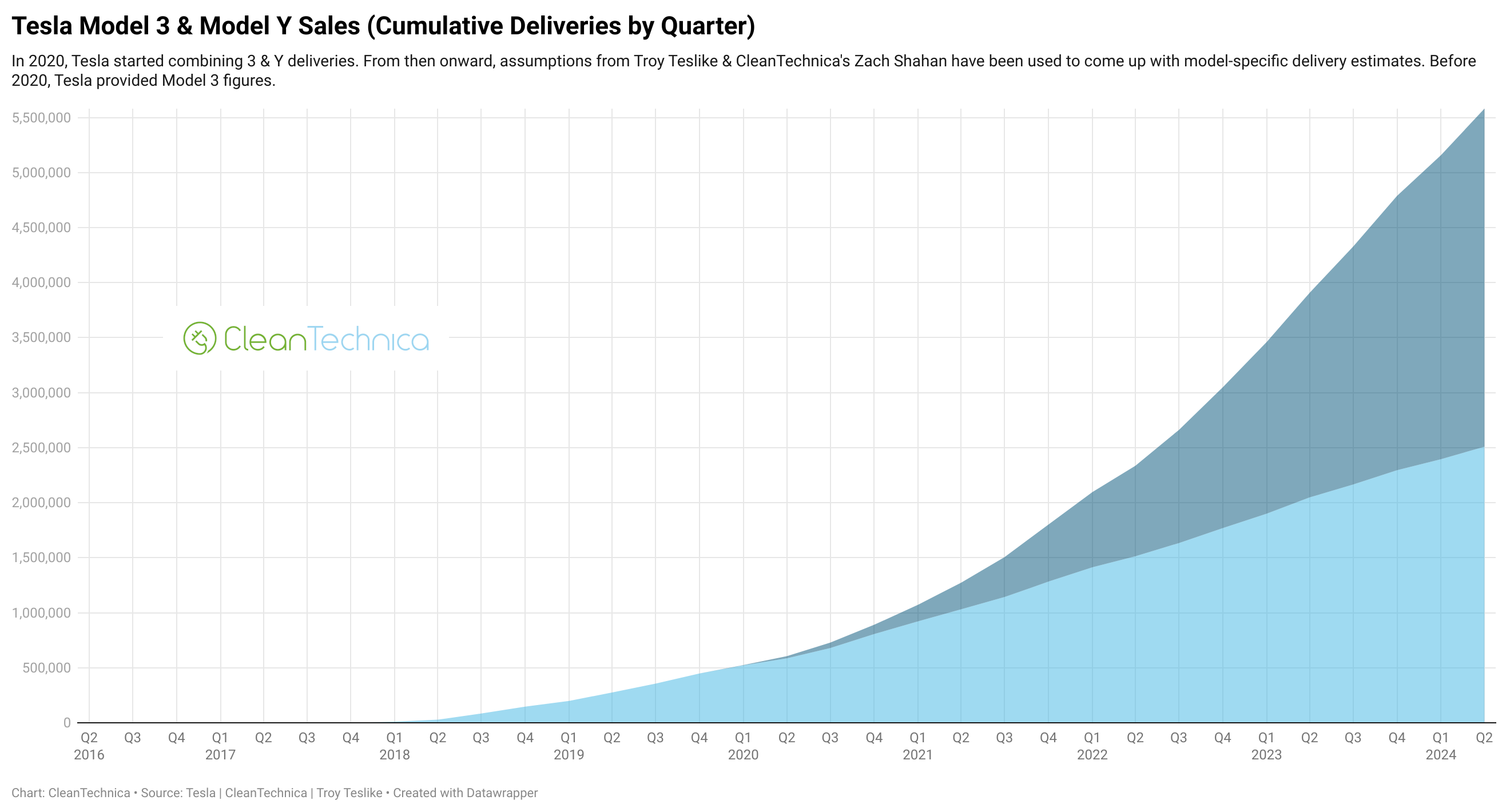
Now we come to cumulative Tesla sales. Whereas this graphic for a long time looked like a perfect exponential growth chart, you can see a clear change in direction at the top now. Does this turn into something like an S-curve chart? Does Tesla regain its sales growth and that bit at the top becomes something like a little dent in the broader picture? We shall see.
These three charts above then look at the presumed cumulative sales trends of the Model Y and Model 3. It’s a similar story. The only other thing that jumps out to me is that after the Model Y surpassed the Model 3 in cumulative sales, it’s been running away quite rapidly. I use the same scale for the two models so that they can be compared. I have a feeling next quarter is going to make the Model 3 look like a small character in the story.
I’m also including some interactive charts below. These typically display much better on a normal computer, not on phones. Interactive versions of a few of the charts displayed above are included, but the first interactive chart is a new one, one where you can toggle between quarterly sales of different models. Enjoy!
Let me know if there’s anything else you’d like to see.
Have a tip for CleanTechnica? Want to advertise? Want to suggest a guest for our CleanTech Talk podcast? Contact us here.
Latest CleanTechnica.TV Videos
CleanTechnica uses affiliate links. See our policy here.
CleanTechnica’s Comment Policy


